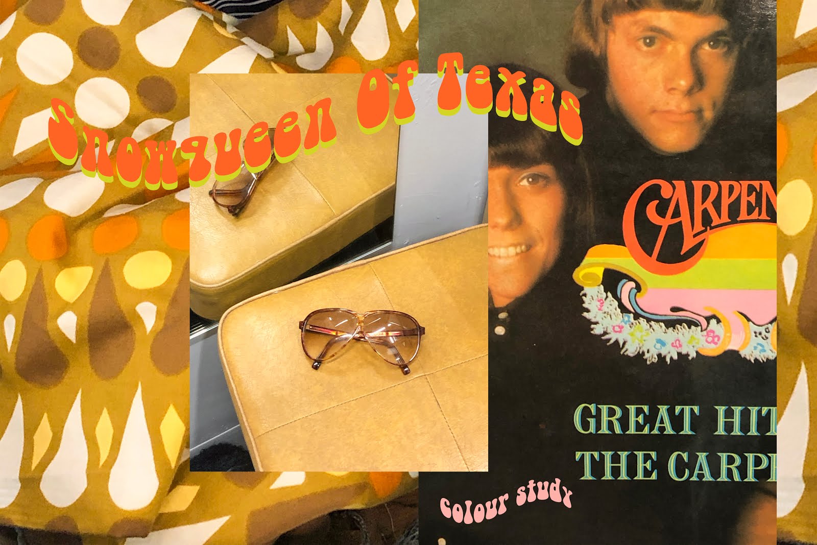
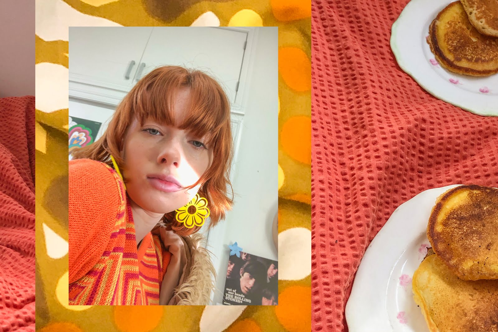
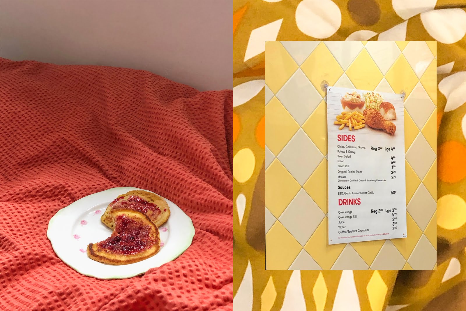
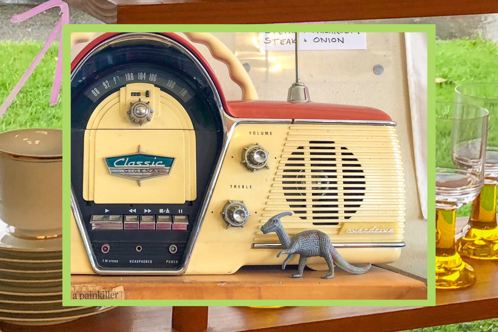
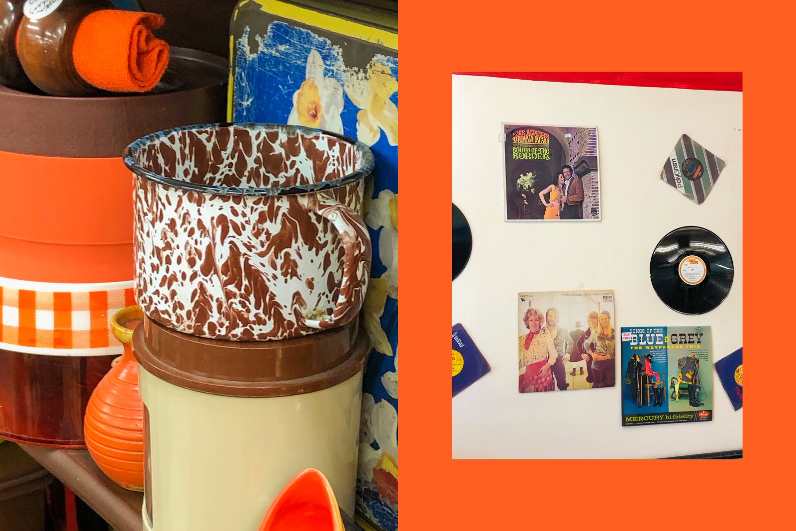
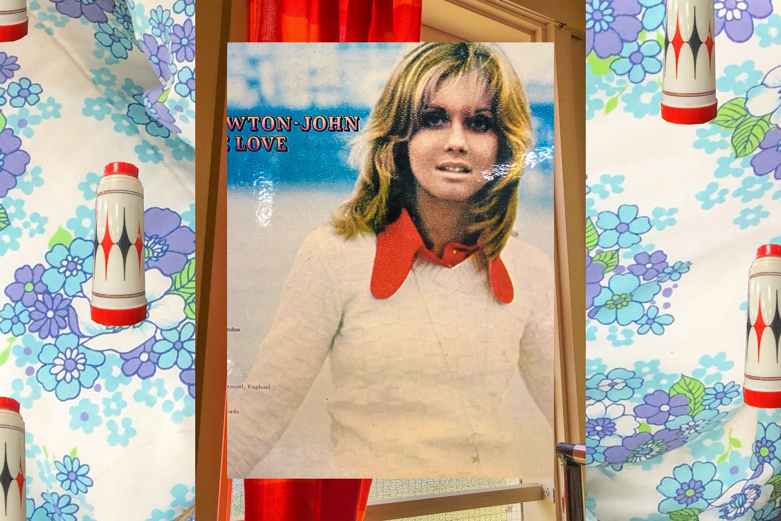
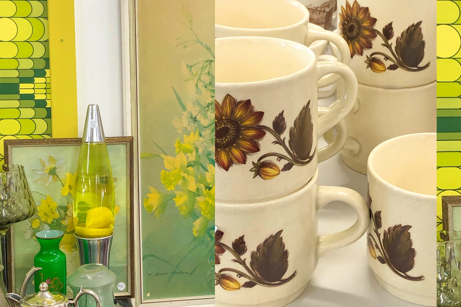
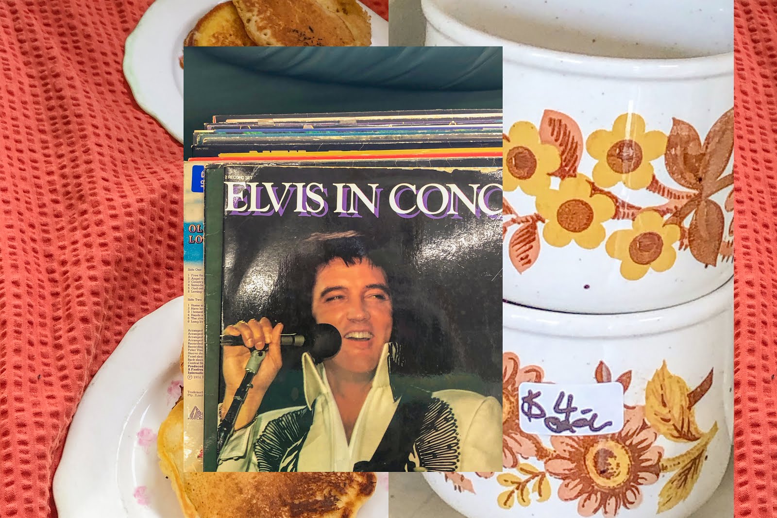
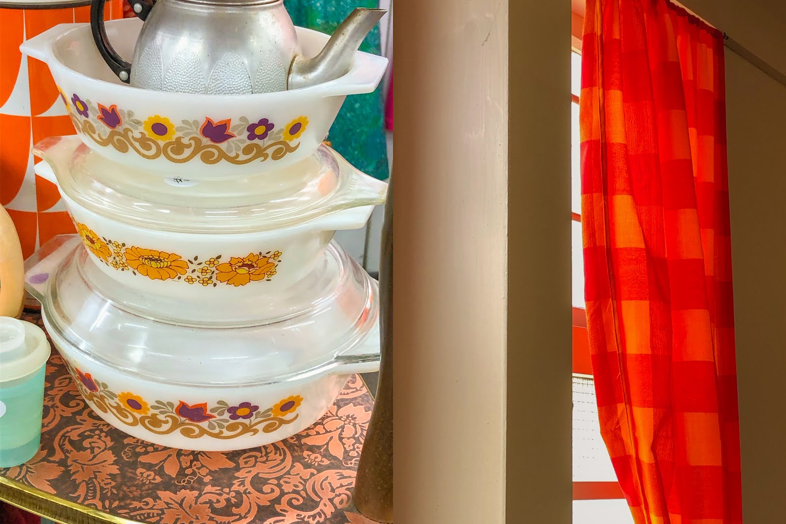
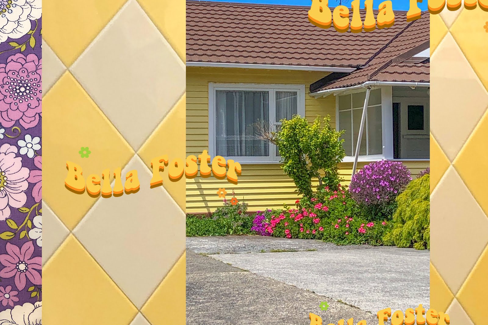
Welcome to my latest spin on the colour study; Garage Sale! One of my favourite things to do is edit photos and have fun mucking around on Photoshop and my monthly Colour Study series is the best way to do that. If you're at all familiar with this blog I'm sure you'll know what I'm referring to, but if not click here to see my latest Colour Study piece!
As I feel like my style and creative work is constantly evolving, I want to make sure that my blog doesn't get left behind. After all, I'm only seventeen and everything I'm doing now is new, exciting and different. Change is inevitable. One of my goals for 2020 is to really hone in on my graphic design and photo editing skills, something that I've been exploring and experimenting with a lot this year. If you've been following my journey I'm sure you can see just how much these skills have evolved already. So, as a branch off of the monthly Colour Study, Garage Sale is a way for me to play around with editing to a new level, taking more risks and just generally experimenting.
My Colour Studies tend to be more of a discussion about life happenings and more personal topics around my career, friends, freelancing etc. Whereas, Garage Sale will be more focused on art and art-making practices. So, if that sounds even remotely interesting to you then read on!
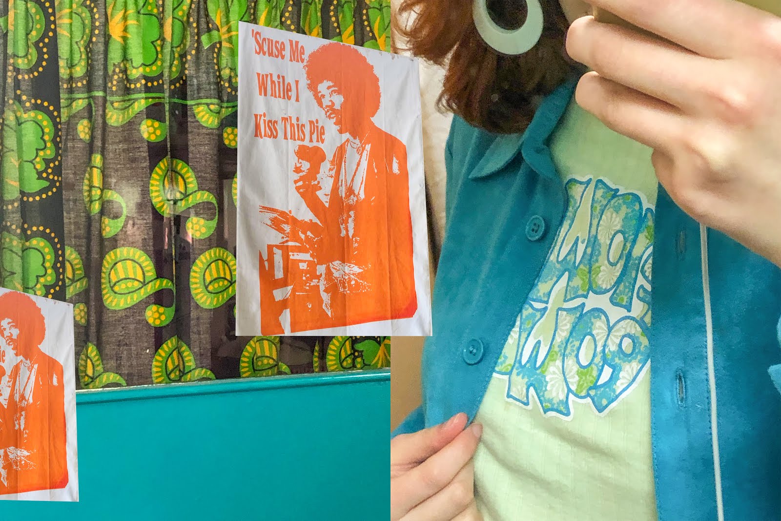
In terms of photo editing, I tend to always use Lightroom, I'm not sure why as I know some other creatives swear by Photoshop. I'll always bring all of my images through Lightroom first, just to touch them up, enhance colours and get rid of darker shadows / blue tones (yuck). I then mock up my first designs in Photoshop. This process is always pretty random and spontaneous and really just involves following my natural instinct and pairing colours, subject matter and contrasting scales together. I tend to establish a general colour scheme early on and then try my best to stick to that, with some leniency here and there.
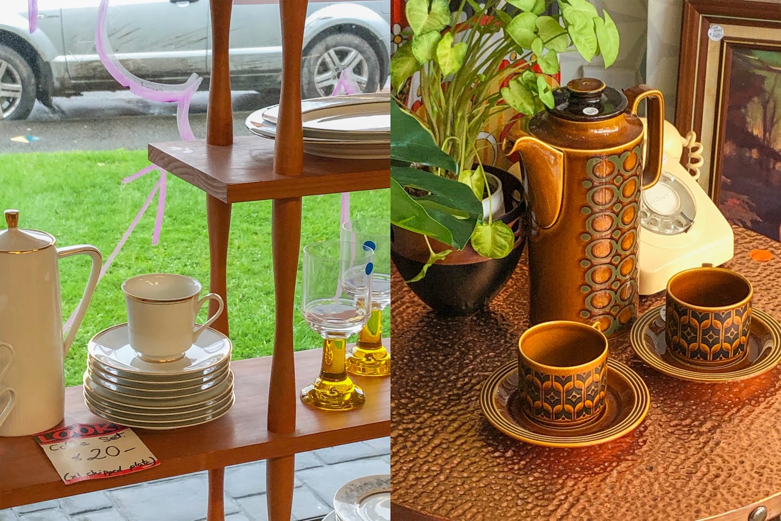
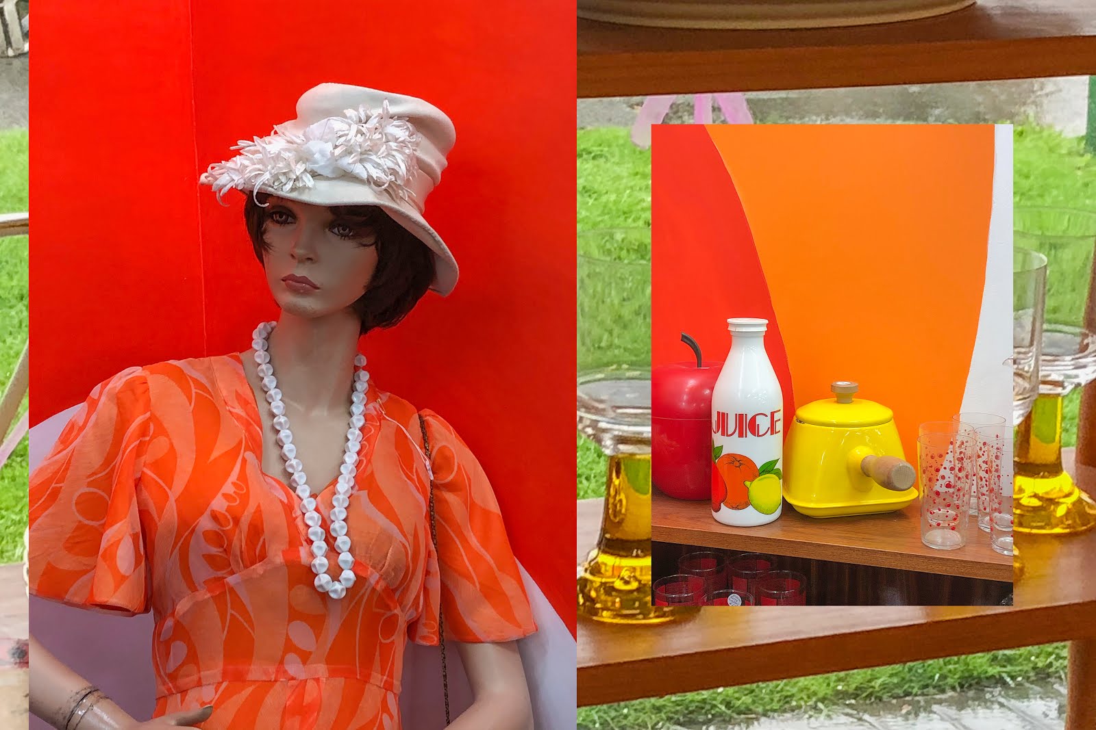
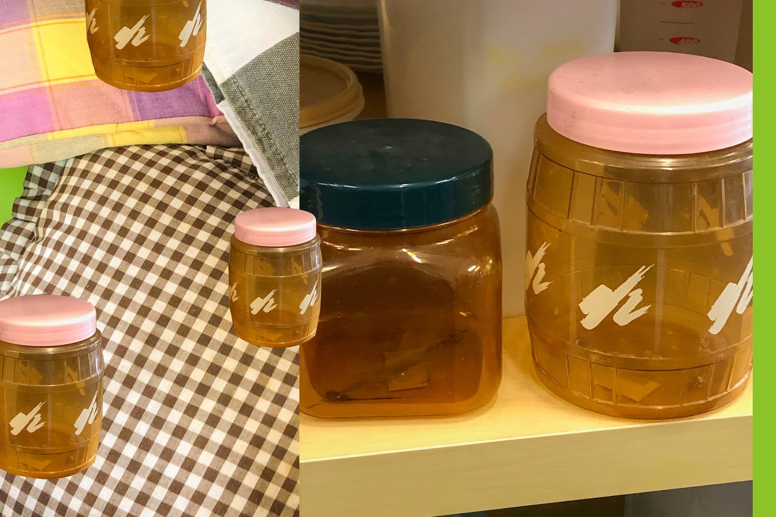
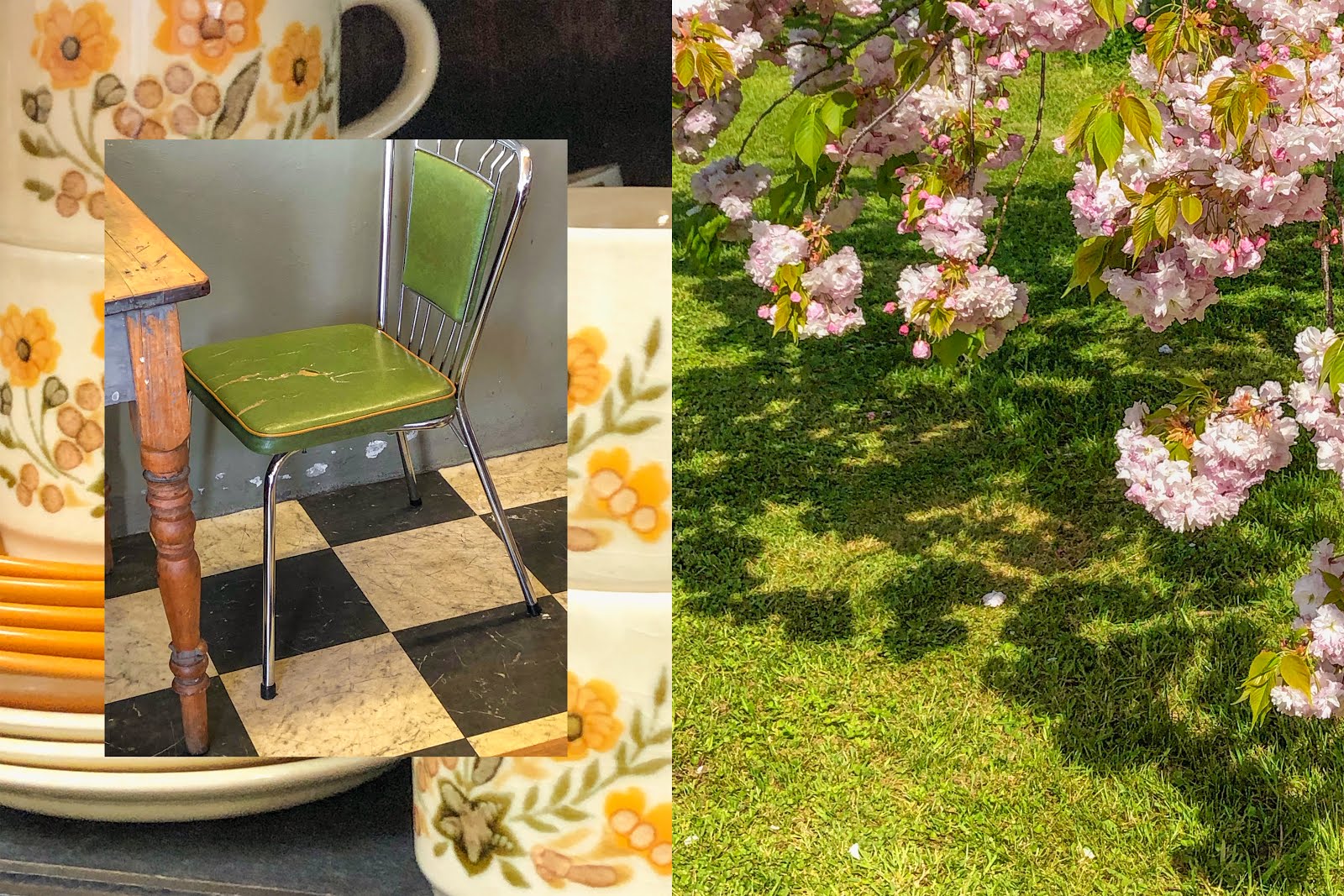
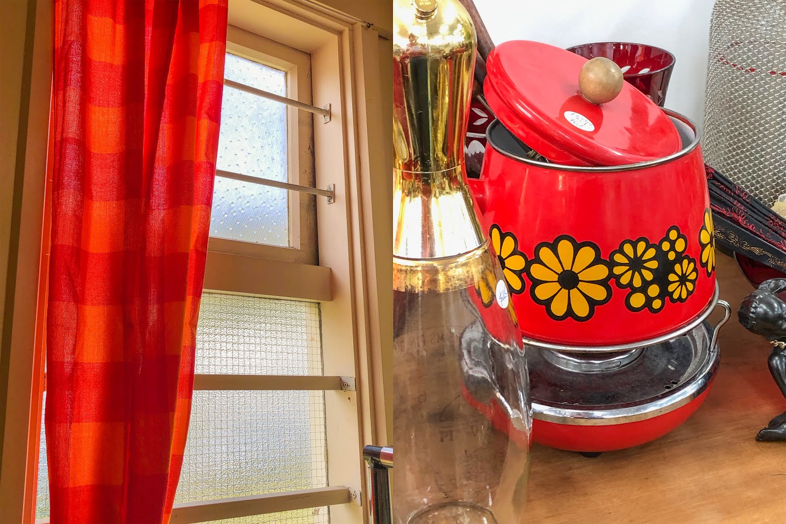
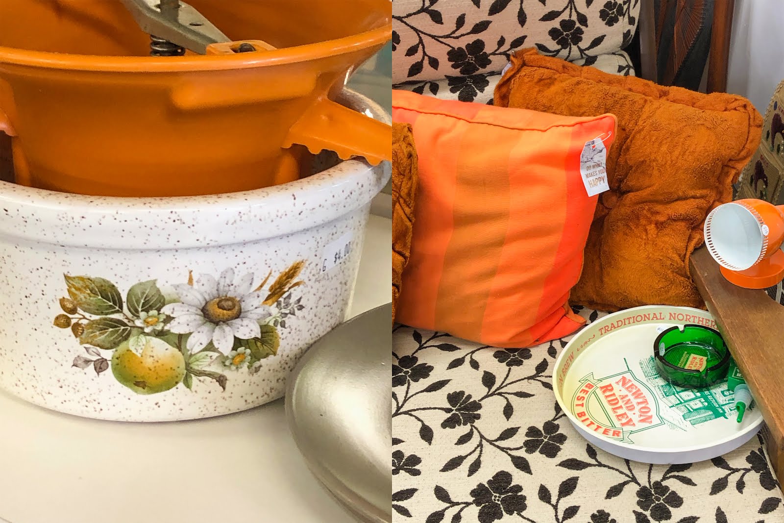
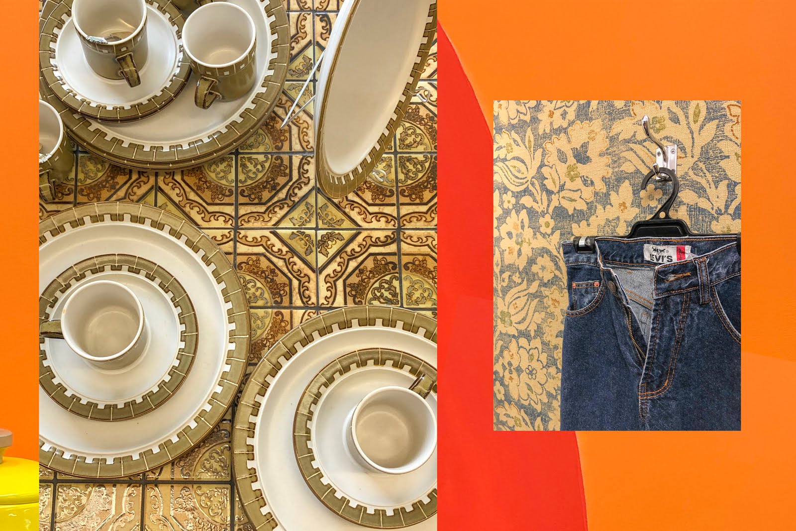
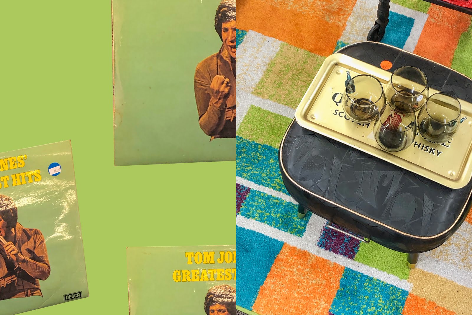
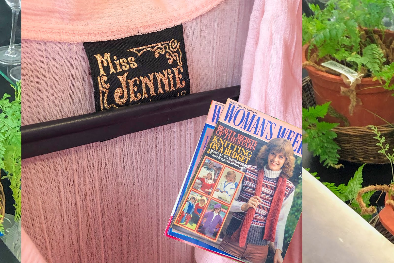
Recently I've had a lot of fun taking photos of groovy retro pottery or Tupperware in op shops and using those as graphics for my designs. I am by no means a professional at this and Ben will often sigh as I take the hardest, longest route to cut and paste in Photoshop. But, hey, it works for me! I'll begin chopping and changing these graphics around, playing with scale and rotation until I'm happy (this will sometimes take hours). My favourite way to create this look is by using graphics almost like miniatures.
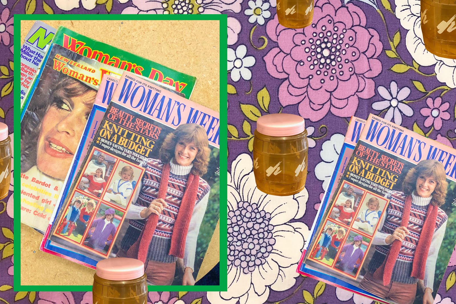
Since I was old enough to crawl I've always had a strong interest and liking for miniatures. I played with Lego as a kid (and sometimes even now) and had an extensive collection of Sylvanian Families. I just adored anything miniature, mini food, animals, furniture, clothing. My mum would even make me miniature sandwiches because I would eat anything if it was "dainty". She also treated me to a trip to a real-life miniatures festival once, which was incredible. I definitely still have that love for little things, so creating images that emulate that feeling of miniature food and homewares is so satisfying. That's where I just love the sixth image down, it took a long time to perfectly cut out those crazy cool retro cylinders, but I just love the way they look as a repetitive pattern/graphic with that child-like collage feel.
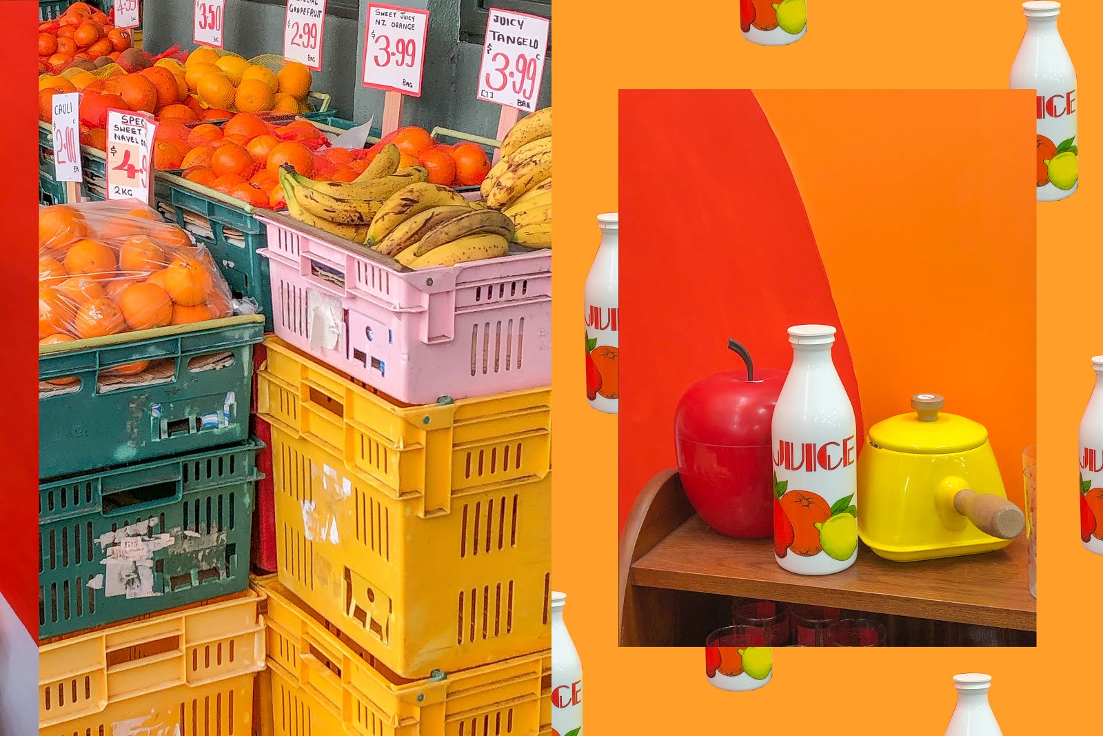
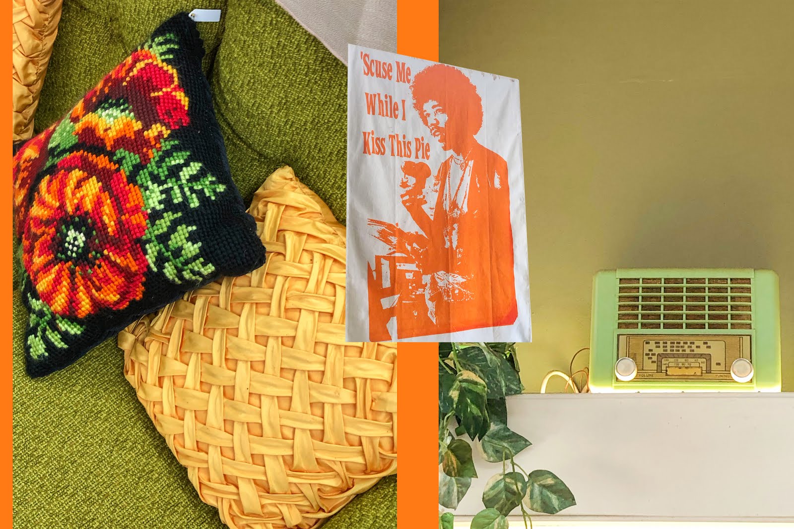
Colours are obviously super important to any composition and that's always where my art begins and ends. Every image has a distinct colour palette and the perfectionist inside me won't let a single element be out of place. That's where Photoshop skills are so handy, having that ability to change an image by removing a certain colour or element will always result in a more cohesive and eye-catching piece of art. An example of this would be the eighth image down, where the colours match in an incredibly satisfying way. This came from a lot of editing, cropping, rearranging and just straight up photo manipulation, I love it! Photoshop allows you to create these compositions that only exist in your mind, from real-life images and textures.
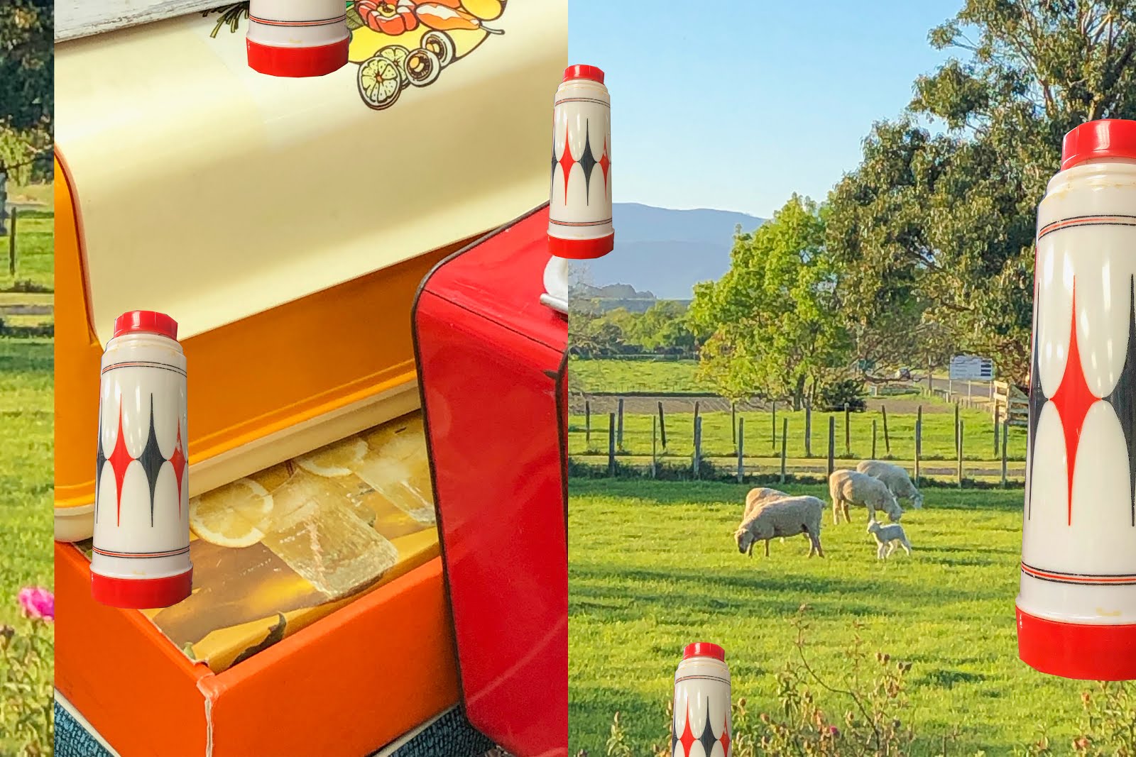
My overall favourite would have to be the twelfth image from the top, I love the retro thermos graphic, paired with the iconic Kiwi image of rural sheep. To me, this image just screams rural New Zealand and reminds me of a funky retro postcard design or something. Playing around with the repetition in the thermos and the well known Kiwi symbols in this composition create such a unique image that is at the same time recognisable.
I'd love to hear your thoughts on this new series and hopefully, it's given at least one of you some ideas or inspiration to go and create some art! As always, I appreciate any feedback and discussion, stay tuned for the next Garage Sale photo series coming soon...
Bella 🌼

No comments :
Post a Comment